
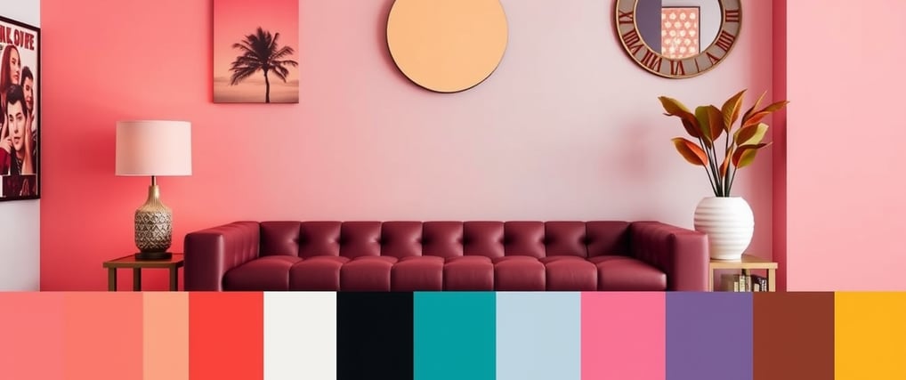
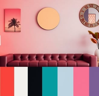
Color Palettes for Perfect Design Inspiration
Choosing the right color palette is crucial for creating a visually appealing and harmonious design. Whether you're designing a website, a brand logo, or an interior space, the colors you select can significantly impact the overall aesthetic and mood. Here are some tips and inspirations for picking the perfect color palette
Understanding Color Theory
Before diving into color palettes, it's essential to understand the basics of color theory. Primary colors (red, blue, and yellow), secondary colors (green, orange, and purple), and tertiary colors (a mix of primary and secondary) form the foundation. Complementary colors, which are opposite each other on the color wheel, create high contrast and vibrancy.
Popular Color Palettes
Monochromatic Palette:
Description: Uses different shades and tones of a single color.
Use Case: Ideal for creating a cohesive and balanced look.
Example: Various shades of blue for a calming and professional design.
Analogous Palette:
Description: Consists of colors that are next to each other on the color wheel.
Use Case: Great for creating a harmonious and serene design.
Example: Red, orange, and yellow for a warm and inviting atmosphere.
Complementary Palette:
Description: Pairs colors that are opposite each other on the color wheel.
Use Case: Perfect for creating high contrast and vibrant designs.
Example: Blue and orange for a dynamic and eye-catching look.
Triadic Palette:
Description: Uses three colors evenly spaced around the color wheel.
Use Case: Ideal for creating a vibrant and balanced design.
Example: Red, yellow, and blue for a bold and energetic feel.
Tips for Choosing the Right Palette
Consider the Mood:
Different colors evoke different emotions. For example, blue is calming, red is energetic, and green is refreshing.
Brand Identity:
Ensure your color palette aligns with your brand's values and message. Consistency is key in branding.
Target Audience:
Understand your audience's preferences and cultural associations with colors.
Testing:
Experiment with different palettes and get feedback. Sometimes, the best palette is discovered through trial and error.
Tools for Creating Color Palettes
Adobe Color:
A powerful tool for creating and exploring color palettes. It offers a wide range of pre-made palettes and allows you to create your own.
Coolors:
A user-friendly tool that generates random color palettes with a simple click. It's great for quick inspiration.
Color Hunt:
A curated collection of beautiful color palettes. It's perfect for finding trendy and modern color combinations.
Conclusion
Selecting the right color palette can elevate your design from ordinary to extraordinary. By understanding color theory, exploring popular palettes, and considering your brand and audience, you can create visually stunning and emotionally resonant designs. Don't be afraid to experiment and have fun with colors—the possibilities are endless!